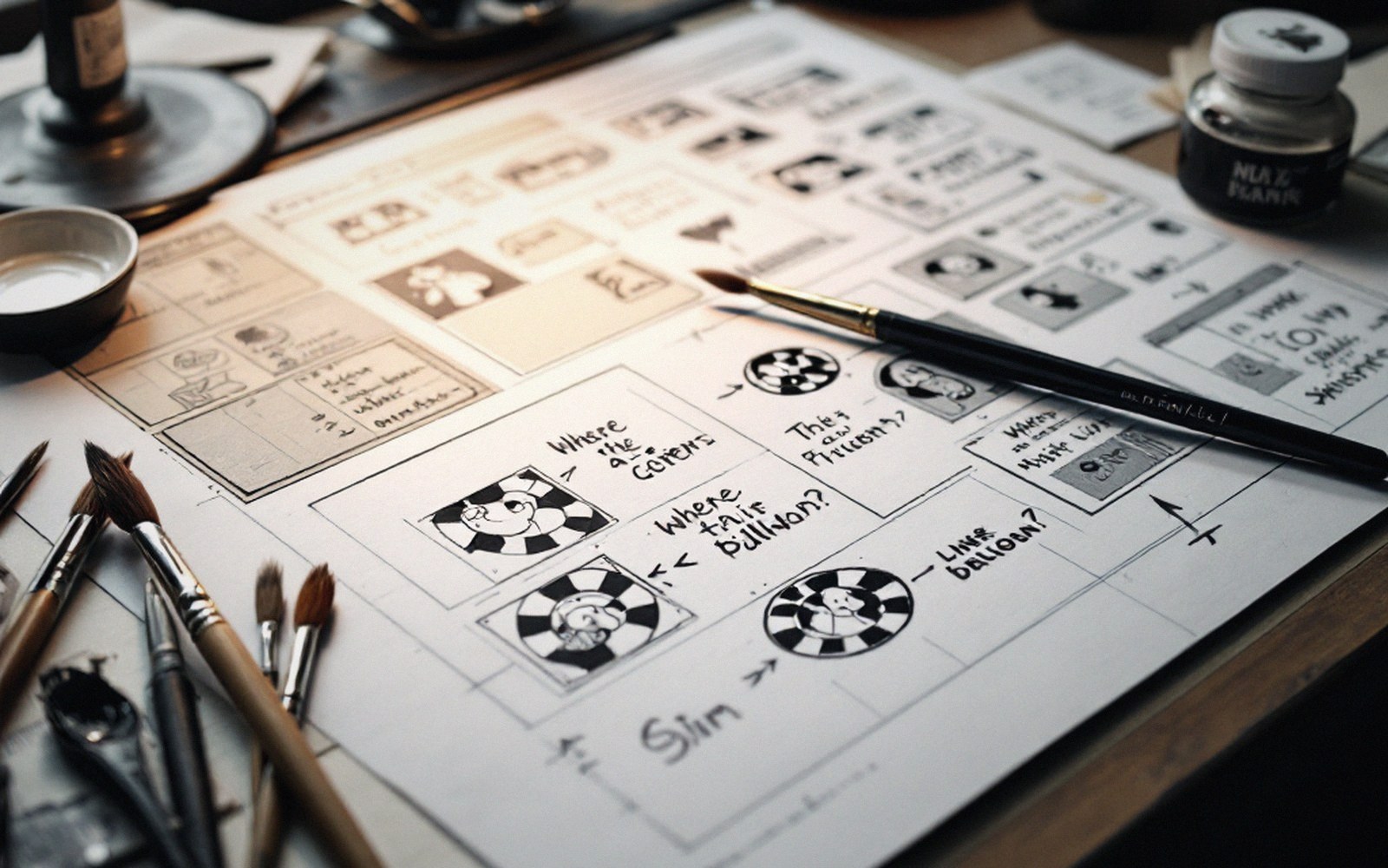
Sound as drawing
Where lettering stops being type and becomes part of the art.

When the letter is the line
At some point in the lettering process, the word stops being language and starts being mark-making. A crash rendered in jagged, expanding capitals is not describing a sound — it is performing one. The shape of the letters, their weight, their angle, and the way they break across the panel all carry meaning that the words alone cannot.
This is the territory where lettering and drawing overlap. In mainstream comics it goes by the loose label "sound effects," but that undersells what is actually happening. The letterer — or the cartoonist, in studios where one person does everything — is making a drawing that also reads as a word. Both things are true at once, and neither can be sacrificed to the other.
The conventions that govern regular balloon lettering fall away here. Caps are still almost universal, but consistency of stroke width is gone; a single letter in a well-made sound effect might start thin, swell under pressure, and flare at the exit. A brush gives this naturally, the line inflecting with every shift of the wrist. A pen demands deliberate thick-thin decisions, stroke by stroke. Either way the mark has to behave like a sound, not like type — which means it has to have dynamics, a sense of attack and decay built into its outline.
Color and fill become structural. The interior of the letterform can hold a gradient suggesting heat, or a flat black that reads as sudden impact; white inline strokes give depth without adding a new hue. These choices are not decoration. They are the same decisions a background artist makes about light source and value — applied to an alphabet.
Placement matters just as much. A sound effect that sits neatly in an empty corner is illustrating; one that overruns the panel border, shears across figures, or splinters out of the action is participating. The edge of a letter crashing through a frame line is the same gesture as a figure breaking the frame: it announces an energy too large for the box it was given.
The failure mode is effort without integration. A sound effect rendered with obvious technical skill but dropped into the panel as a label — hovering above the action rather than emerging from it — reads as decoration. Integration means the sound effect and the drawing share a light source, or share a direction, or that the figures react to the letterform as if it occupies the same space. When that works, the word and the image have merged into a single statement, and separating the lettering from the art becomes not just difficult but meaningless.