Panel shape and duration
The proportions of a panel are a timing instruction, whether the artist intends them or not.
Shape is the reader's clock
A wide, horizontal panel invites the eye to move laterally across it before it exits — across landscape, across a crowd, across a face held in silence. The reader lingers, even without being told to. A tall, narrow panel compresses that horizontal travel and pushes the eye downward and out, fast. Same area on the page, different duration in the mind.
This is not a rule someone invented. It follows from how the eye scans. In a wide panel the gaze has more lateral ground to cover before it reaches the right edge and jumps to the next beat; in a narrow one the exit comes quickly. Width prolongs; height hurries.
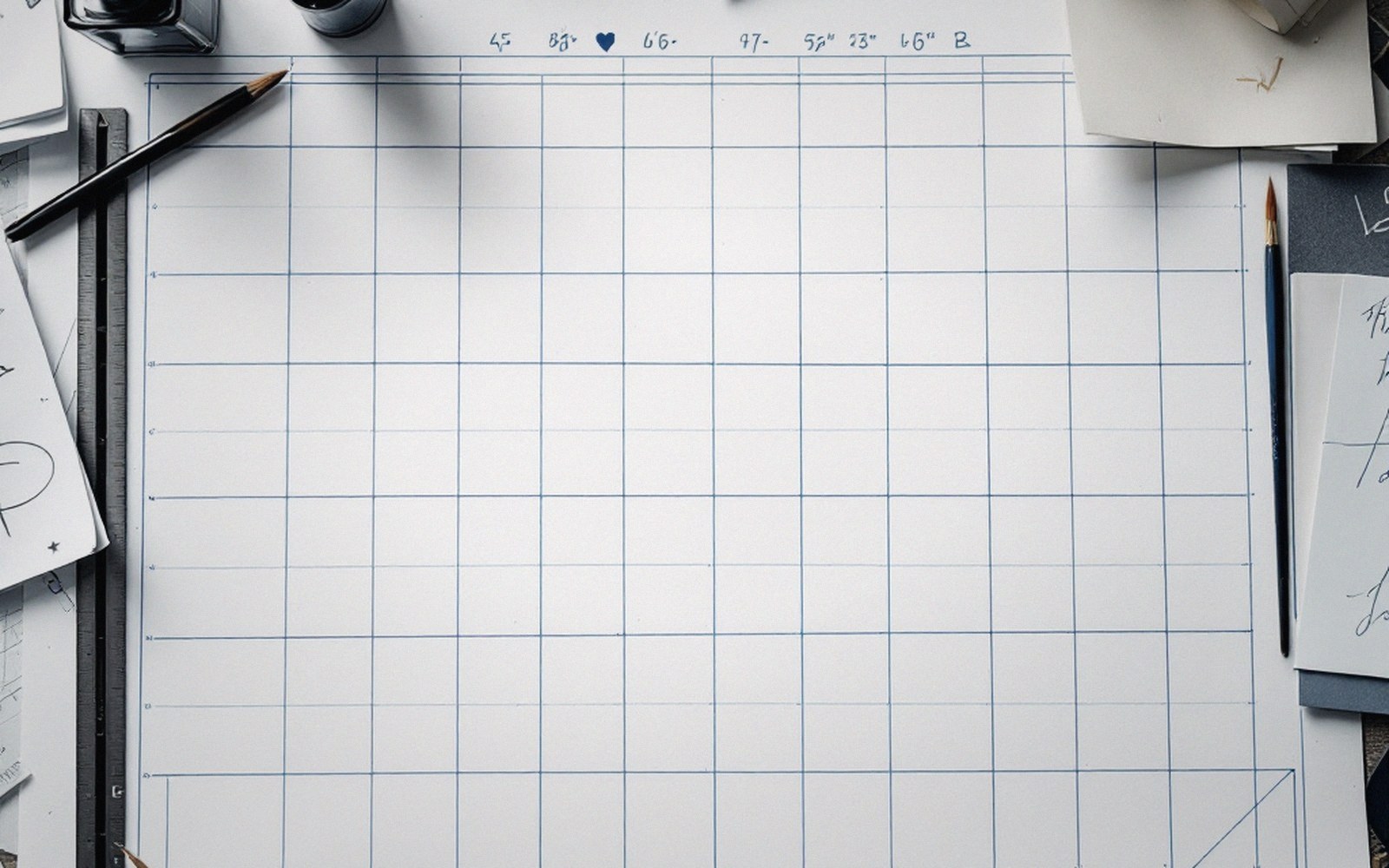
The practical consequence is that a fixed grid can be tuned at the thumbnail stage by varying panel aspect ratio without touching the overall page structure. A six-panel grid that alternates wide and tall tiers already encodes a rhythm — slow, fast, slow, fast — before a single figure is drawn into it. The cartoonist who understands this stops asking "how long should this moment last?" and starts answering it with a rectangle.
Extreme cases make the principle legible. A full-width horizontal strip — one panel spanning the tier — slows the reader to something close to a held breath: a horizon, a skyline, a character staring at something the reader cannot yet see. A thin vertical sliver does the opposite, suggesting speed, compression, a cut. Action sequences have used stacked verticals for decades because the eye drops through them without pause. The contrast between the two types, on the same page, creates tempo.
The trap is inconsistency without intention. A wide panel that contains nothing to look at still burns duration the reader didn't agree to spend — they arrive at the right edge faster than the shape promised and feel cheated. The shape sets a contract. If the content doesn't honor it, the panel feels empty rather than slow. Width has to earn its time with something to look at, or the pacing effect inverts: the reader skips rather than lingers.
Area, meanwhile, is mostly irrelevant to duration. A tall panel and a wide panel of identical area read at different speeds. What matters is the ratio, not the size. Keep that distinction in mind when breaking a tier: you are not distributing space, you are distributing time.