Feathering
Tapered lines doing the work of grey, without a drop of tone.
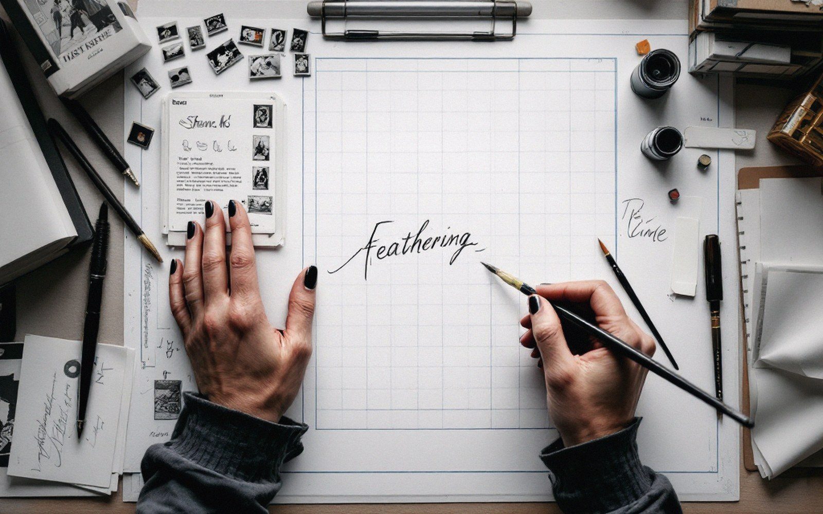
The technique
Feathering is the simplest halftone that exists: a cluster of parallel strokes, each one beginning at full weight and lifting off the surface so the tip of the brush or nib arrives at nothing. The taper is the point. Where the strokes are close together, the eye reads dark. Where they spread apart, the eye reads light. No mechanical film, no dot screen — just the pressure of a hand, repeated.
The word comes from the resemblance to a feather's barbs, and the analogy holds mechanically too. A central dark mass — the shadow's edge — gives off progressively thinner lines into the light. The graduated zone between solid black and open paper is what produces the sensation of a curved surface turning away.
Ink on brush is the traditional tool. A loaded kolinsky or red sable will swell under pressure and taper as the hairs leave the paper, generating the profile in a single stroke if the hand is practiced. A flexible steel nib — a mapping nib or a crow-quill — does it differently: pressure opens the tines and widens the line; releasing closes them and the line thins to a whisker. Brush against pen is the real variable here, because each tool's feathered stroke has a character the other cannot replicate: the brush stroke is organic and sometimes wobbles; the nib stroke is stiffer, with a harder lift.

Feathering is not random hatching. The strokes follow the form. On a jaw, they wrap around the curve. On a fold of cloth, they follow the direction of tension. Cross-contour feathering — strokes that travel across the surface rather than down it — reads as a flatter, more distributed shadow and is used where the surface is broad and relatively undifferentiated. The two can be combined in a single passage, the cross-contour establishing the mid-tone, the contour feathering picking out the accent.
The practical concern is print. Fine tips that look pale on a light box can close up entirely on a press, especially on newsprint or cheaper uncoated stock, turning a delicate gradient into a smudged patch. Experienced artists test-print a feathered passage at actual reproduction size before committing to a full page. At stamp size in the thumbnail stage, feathering cannot even be indicated — it is a detail-phase decision, made after the composition is settled and the panel shapes are fixed.