Line weight as depth
The simplest form of perspective is a pen decision made before any line is placed.
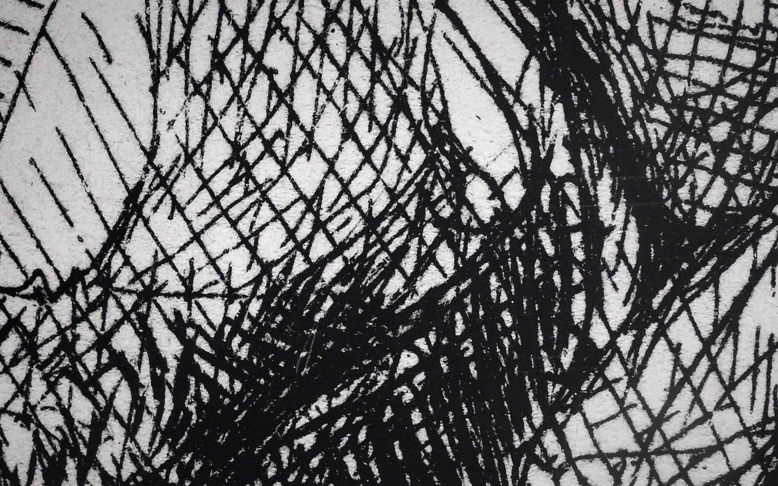
The rule and why it works
Every object in a scene exists in relation to a light source and a spatial layer. The heaviest line belongs to the silhouette edge — the boundary between the object and the space behind it. The lightest line belongs to interior detail: the crease in cloth, the seam on a cheek, the fold of an eyelid. That gradient from heavy outside to light inside mimics the way forms actually separate from each other in space, because in natural light the terminator edge of any form sits in deeper shadow than its surface.
This is not a convention invented for comics; it runs through Baroque engraving, architectural rendering and animation cleanup alike. What comics did was codify it into a production rule simple enough to survive deadlines.
The practical arithmetic is blunt. Take any panel with three spatial layers — foreground, middle ground, background. If the foreground is drawn with the fattest line the brush or nib can carry, the background with its thinnest, and the middle with something in between, the eye reads depth without a single cue from perspective or value. The silhouette of each figure, building or object anchors it to its plane. The interior lines — nosebridges, window mullions, fabric texture — stay thin enough not to compete with that plane-fixing edge.
The most common error is reversing this logic inside a single figure: weighting an eyebrow as heavily as the jaw line, or a lapel seam as heavily as the shoulder silhouette. The result flattens the face or the torso into a diagram. Everything fights for the same plane.
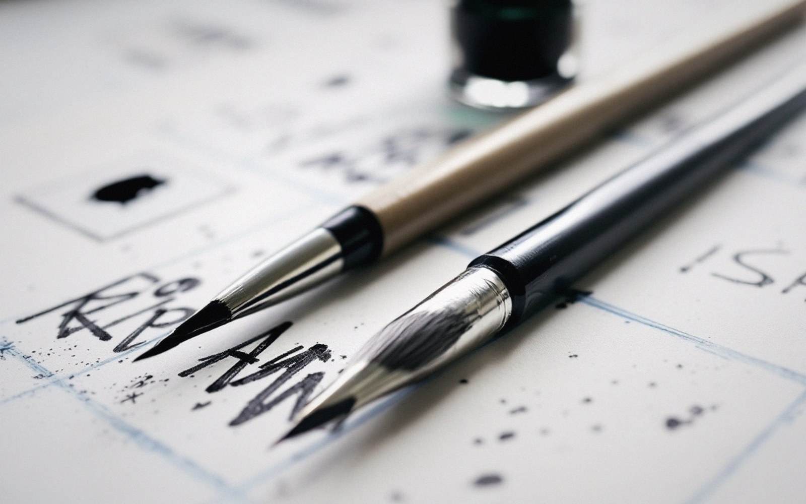
A brush gives a line that swells and tapers from pressure alone, making variable weight a physical reflex rather than a separate decision; a nib can match it but requires a deliberate change of stroke speed or angle. Either way the mechanics are secondary to the decision coming before the mark: which edges are outside edges, which are inside edges, which layer does this object sit in. Once those answers are clear, the weight follows. The line is recording a decision already made, not auditioning options while the pen moves.
There is nothing to add beyond this. No special tool, no tonal rendering, no screentone. One clear distinction — silhouette weight versus interior weight, deep layer versus near layer — and the page acquires dimension from pure line.
