Grey without ink
Screentone is a printed dot pattern on adhesive film, cut and burnished down. What it solves and what it costs in reproduction.
A dot pattern you could hold in your hand
Screentone arrived as a practical answer to a practical problem: how do you get grey onto a page when your press prints only black? The answer that preceded it — halftone photography, feathering, wash — all required either a camera step or a hand skilled enough to fake grey convincingly with ink. Screentone handed that problem to a manufacturer instead.
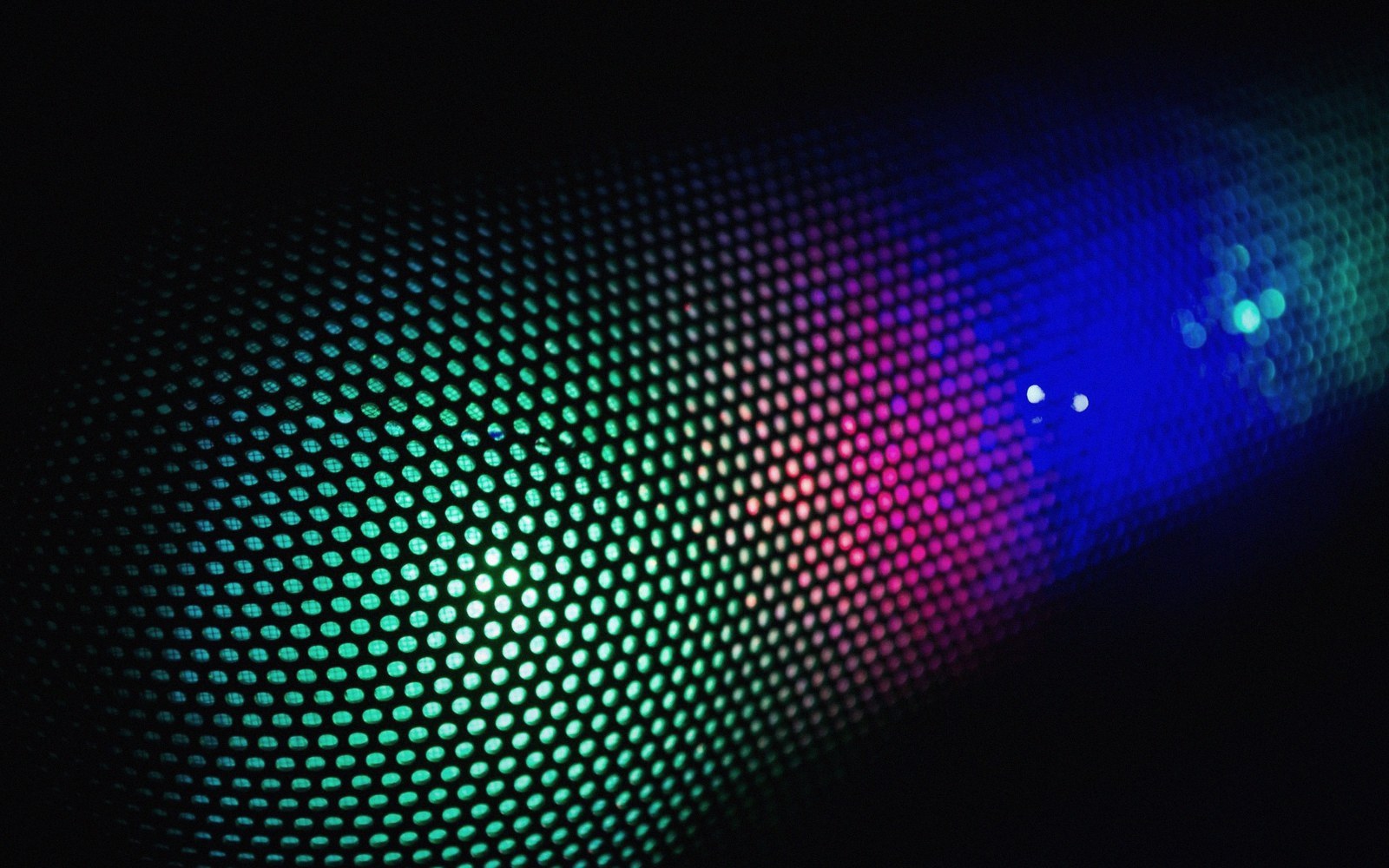
The product is a sheet of acetate carrying a printed dot pattern on one side and a low-tack adhesive on the other. The dots are already halftone-correct, already at a screen angle the press can handle without moiré, already a fixed percentage of black. You lay the sheet over the area you want grey, press it down, lift the excess with a scalpel or scissors, and burnish the remainder flat. Grey applied in perhaps four minutes, no brush, no wash, no photographic intermediate.
The two dominant commercial formats became Letraset's Letratone in Britain and Zip-A-Tone in North America, both widely available from the late 1950s onward. In Japan, where screentone became structurally central to manga production, the sheets are called tōn (tone), and applying them is a production step as standard as inking. The sheets come in numbered densities — typically 10, 20, 30, 40 percent black — and in a range of dot sizes measured in lines per inch, from coarse grain suitable for newsprint reproduction to fine grain for offset litho.
What it costs
The savings screentone offers at the drawing stage arrive with debts at the reproduction stage. The dots are already a fixed screen frequency; if the reproduction process runs a different screen, the two frequencies interfere and produce moiré — that visible wavy interference pattern that makes a panel look like it is seen through rippled glass. Matching the tone sheet's lines-per-inch to the intended print screen is not optional. It is the first question to answer before buying the sheets.
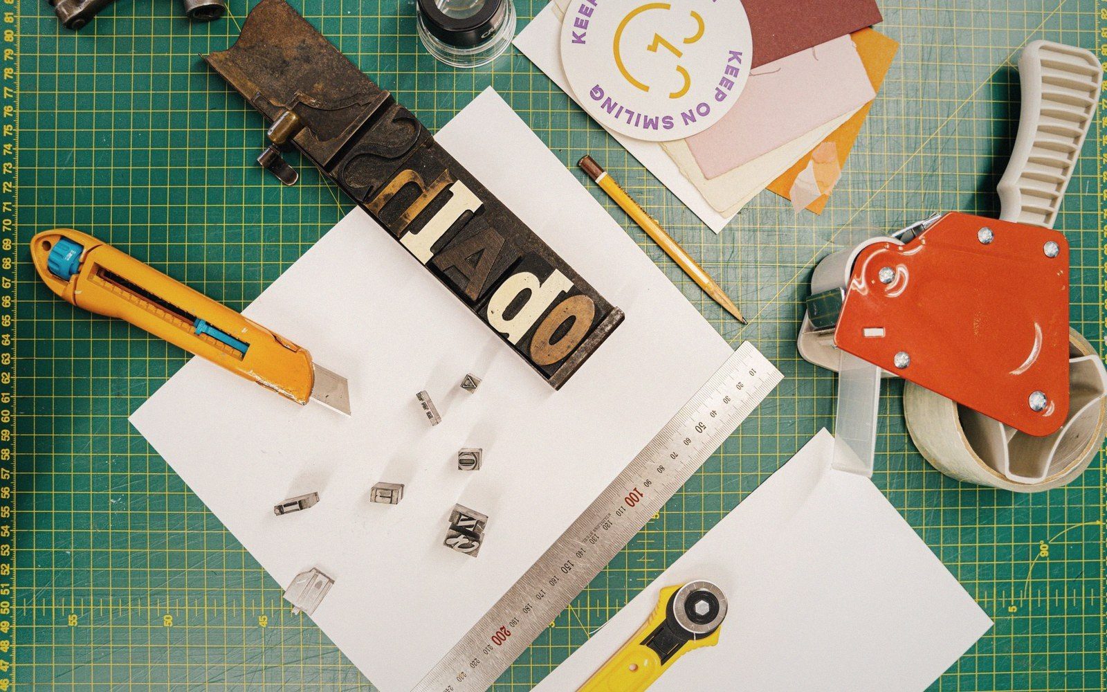
Cutting also leaves a trace. Scalpel work on thin acetate film can nick the paper underneath, and the edge of a torn or cut piece of tone catches light differently from the burnished centre. Printed reproduction tends to flatten both problems, but a careless edge on a clean area of art is visible even after scanning. Burnishing too hard introduces its own artifact: the adhesive thins, the dots spread slightly, and the percentage of black shifts. Screentone rewards an even, moderate pressure with a flat bone or plastic burnisher — the kind of restrained, deliberate physical care that cutting and burnishing demands across all film-based work.
The other cost is expressive. Because the dot pattern is manufactured rather than drawn, it carries no line energy. It reads as flat, even, mechanical — which is sometimes exactly right. A moonlit sky, a concrete wall, a school uniform: screentone's flatness is honest to those surfaces. But attempt to build volume with it — to model a face around a cheekbone the way a feathered line might — and the overlay method becomes awkward. Layering two sheets of tone doubles the dot density and risks moiré between the sheets themselves. Some artists use tone for background and flat shadow, while reserving rendered linework for anything anatomically complex. That division of labour is a compositional decision as much as a technical one, and it shows in the finished page.
Digital tools now simulate screentone as a filter, producing dot patterns that can be scaled, angled, and applied without adhesive or scalpel. The technical problems of matching screen frequency remain, but they resolve at export rather than at the drawing board. What changes is the physical act: the resistance of the acetate under the blade, the slightly different smell of a freshly burnished sheet, the satisfying lift of the excess. Those are not arguments for doing it the old way. They are simply what was traded away, and knowing what was traded is part of understanding what the page became.