Reading order is a diagram
Before it is a drawing, the page is an arrow. Where it goes wrong.

Before the drawing, there is an arrow
A thumbnail is not a sketch of pictures. It is a diagram of direction. The eye enters a page in roughly the same place every time — top left for a left-to-right reader — and if the cartoonist has done the job, it leaves at the bottom right and turns the page. Everything in between is a path, and the path has to be unambiguous.
At stamp size, before any detail exists to distract you, the directional logic is all you have. Which panel does the eye hit second? Where does it go after that? Drawing small on purpose enforces an honest answer: if you cannot trace the reading order with a finger across a two-inch thumbnail, the full-size page will not fix it.
The failures are predictable. A wide panel that runs the full top of the page works as an entry — the eye lands, reads left to right, exits right. But if the next tier has three columns of equal weight and the balloon tails are ambiguous, the reader makes a guess. Sometimes they guess wrong: they skip from panel one to panel three, read three, double back to two, and the beat is broken before it lands. That is not a reader failing; that is a diagram that was never drawn.
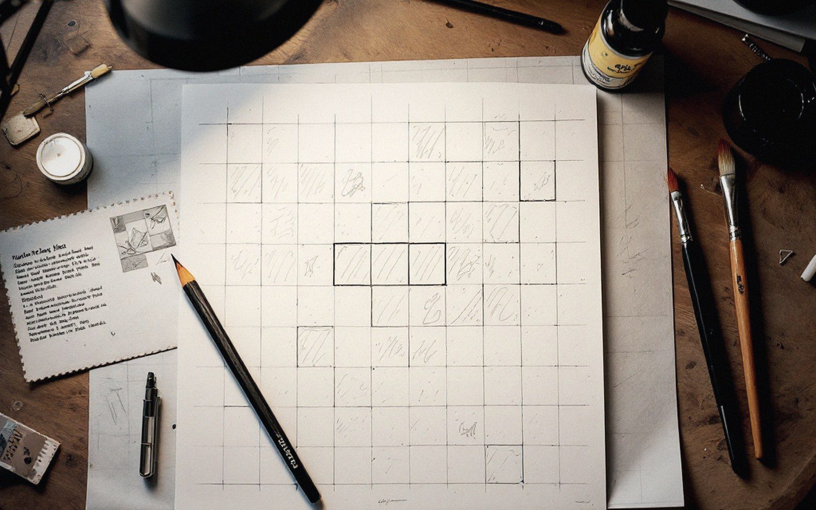
Symmetry is the most common culprit. Two panels side by side of equal size, equal value, equal visual weight, with no tail or eyeline to pull the reader left before right — and the order becomes optional. The fix is almost always small: a heavier figure on the left, a balloon that points leftward, a lighter panel on the right. None of this requires redrawing. It requires noticing the problem at thumbnail stage, when the arrow is the only thing on the page.
The other common break is a layout that reads down the left column before traveling across — a configuration imported from newspaper strips applied to page formats where it does not belong. Tier logic and column logic conflict, and the reader stalls at the intersection.
A clear reading order does not announce itself. Done well, it is invisible: the reader moves through the page without choosing, because the choice was made already, in pencil, at the size of a postage stamp.