The page is decided at stamp size
Thumbnails are drawn small on purpose. At two inches across, only the decisions that matter survive.
Why small is the right size to think
The thumbnail is a deliberate act of constraint. By drawing the page at roughly stamp size — two inches wide, proportional to the final — you strip the work of everything that cannot matter yet: the quality of a line, the texture of a surface, the precise angle of a jaw. What survives that reduction is structure. Mass against mass. Dark against light. The sequence of where the eye lands and the order in which it travels. These are the decisions the page cannot recover from later, and they are best made small, fast, and without the cost of commitment that a full-size drawing demands.
Working at two inches enforces illiteracy. You cannot letter at thumbnail scale; you can only block the space a balloon will need. You cannot render tone; you can only decide whether a panel reads light or dark. You cannot construct a convincing figure; you can only draw a shape that implies a body in a position. This is not a limitation — it is the method. The thumb forces you to think in units of visual weight rather than units of craft. It asks: does this page work as a diagram before it works as a drawing?
The relationship between thumbnail scale and final scale is a zoom, not a translation. A mistake made at two inches costs nothing. The same mistake found at the final board after two hours of inking costs the afternoon. More importantly, it costs the sequence — a page drawn wrong can be redrawn, but a structural error found at inking tends to be patched rather than fixed, and patching a structure is always visible.
The decisions that live at thumbnail scale
Entry point. Every page has a place where the eye arrives. That place is usually the top-left, but it can be seized and redirected by a large dark value, a strong diagonal, or a figure that commands scale. Where the eye enters determines what comes first narratively, before a single word has been read. At stamp size, the entry point is obvious or it is absent — at full size, local detail can disguise a page that has no clear entry at all. The thumbnail makes the problem visible while it is still solvable.
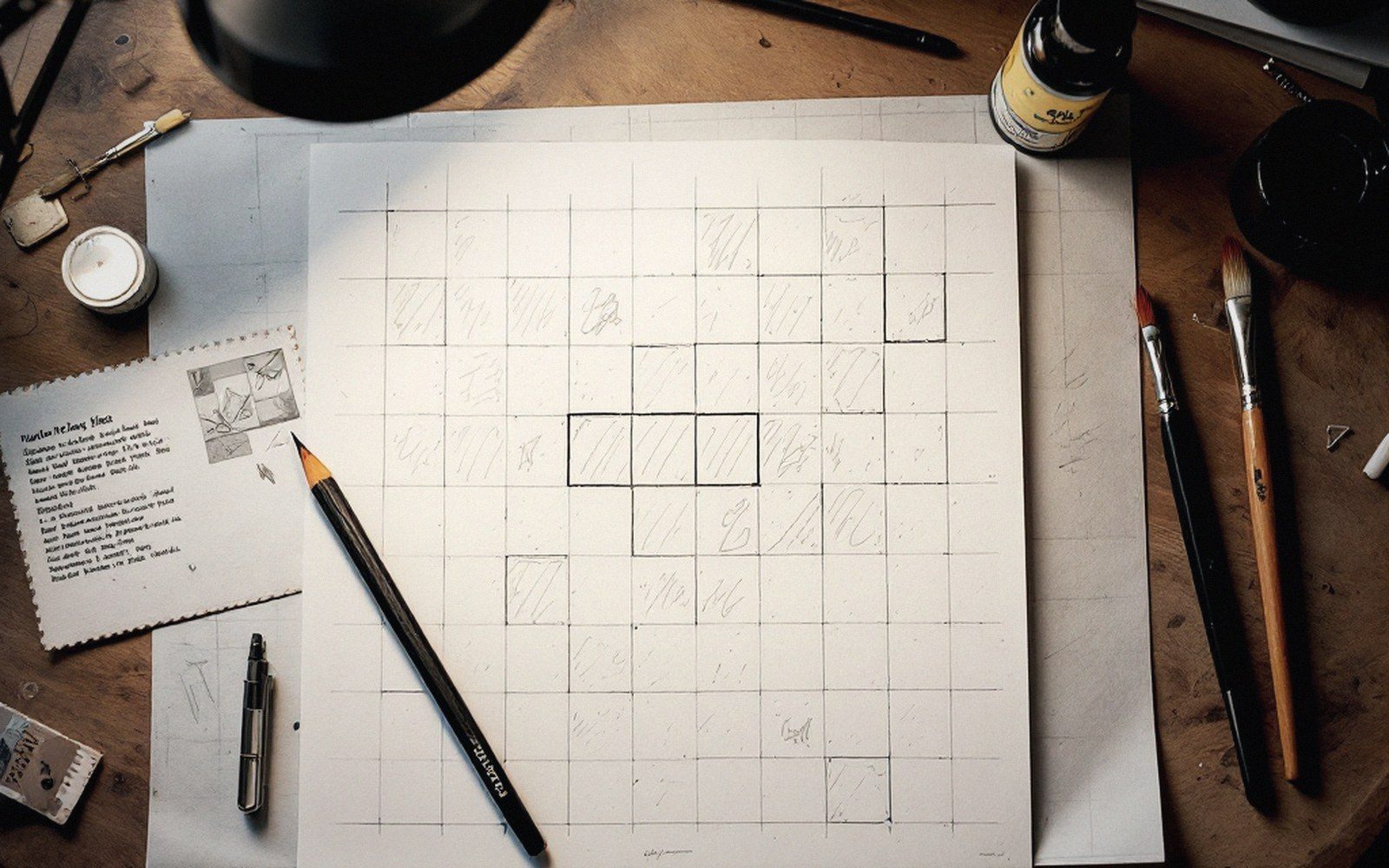
The beat count. How many things happen on this page is a question of how many panels it holds, and more subtly, how much the reader is made to pause at each one. A six-panel grid with uniformly sized panels suggests six events of roughly equal weight. A page where one panel occupies half the area and five share the other half says something different: one event dominates, the rest are glimpses. These ratios are what beats per page means in practice — and you cannot hear that rhythm until you can see all the panels at once. At stamp size, the whole page fits in the field of one glance. At full size, you are inside it, and the count requires effort to perceive.
The dominant panel. Every page benefits from a hierarchy — one panel that is emphatically the largest or the most visually weighted. This is not the same as a splash, which spends the whole page on a single image. It is the compositional choice that tells the reader where the page is going, which moment is worth the most, which image will carry memory away after the page is turned. Identifying the dominant panel at thumbnail stage is easy: the eye finds it without instruction. If it cannot, the page has no hierarchy, and no amount of rendering will add one.
Panel sequence as a path. Reading order in comics is a convention — left to right, top to bottom in most Western-language books — but it is also a design problem. Panels can be arranged in ways that clarify the path or interrupt it. Size, value, and the angle of figures all create vectors that either reinforce the reading order or fight it. Before it is a drawing, the page is an arrow, and the thumbnail is where you verify the arrow points the right direction. If the eye wants to jump from the first panel to the third before reading the second, the thumbnail reveals it. The fix is a thumbnail correction. Undiscovered, it becomes a published confusion.
The gutter as interval. The white space between panels is not neutral. A consistent gutter signals consistent time; a widened gutter tells the reader that more time passes here than elsewhere; a tight gutter — or no gutter at all — compresses two images into something like simultaneity. At thumbnail scale, gutters are visible as part of the page's overall texture. You can see, in a glance, whether the intervals are doing anything or just dividing the sheet. The gutter decisions made in the thumbnail are the ones that shape how the reader experiences duration.
The thumbnail is not the work; it is the decision record for the work.
What the thumbnail cannot decide
Scale of detail, quality of line, whether a face is convincing — these are execution. They belong to the final drawing and to the tools: brush or nib, dry or wet, with or without mechanical tone added afterward. The thumbnail may suggest, in the roughest marks, that a panel is dark — but whether that darkness comes from spotting blacks or from applied screentone is a decision for the board. The thumbnail may reserve a region at the top of a panel for a speech balloon, but the actual size and placement of that balloon, and what it does to the picture underneath it, is a late decision made by the letterer.
This division of labor is not accidental. It is what makes thumbnailing an act of thinking rather than drawing. The page made at full size without a thumbnail is a page that mixes structural decisions with rendering decisions, and the two have no business being made at the same time. Structure is global — it depends on all the panels at once. Rendering is local — it lives inside a single panel at a time. Trying to think globally while working locally is why otherwise skilled drawings assemble into incoherent pages.
The thumbnail as a document
In practice, a thumbnail page looks like almost nothing: a dozen scratched rectangles, rough shapes in pencil or a blunt marker, arrows indicating balloon placement, a letter marking which panel is darkest. It is comprehensible only to the person who made it and, sometimes, to an editor who has learned to read them. This is fine. The thumbnail is not the work; it is the decision record for the work.
Some artists thumbnail a full issue's pages in a single session before drawing a single final panel. Seeing twenty-four pages at stamp size simultaneously makes arc-level decisions visible — where the book breathes, where it presses, how chapter breaks fall, whether the density is even or monotonous. The page is decided at stamp size; the issue is navigated at the same scale. Nothing drawn bigger adds clarity that this small view does not already contain.
Cabanon Press is an independent guide to comics craft. It is not a publisher, retailer or literary agency, and does not accept submissions or manuscript inquiries.